Playable Ads — A new ad format for Meta
For years, Meta couldn't make playable ads work, while competitors built entire businesses on the format and pulled away the app and gaming budgets that used to be Meta's. I started this with one engineer, no PM, and no roadmap slot, and shipped it across Facebook and Instagram.
Gaming's share of Meta's app ad revenue, lost in two years. Playables were the format to regain that share, and the one Meta hadn't cracked.
A playable ad is a short, interactive demo of an app. Tap "Try demo" on a video ad, and you're playing the app before you decide to install.
It's one of the strongest formats in mobile advertising, and the biggest gap in Meta's ad lineup when I started.
Losing Ground to Competition
Gaming's share of Meta's app ad revenue fell from 21% to 13.6% in two years, and AppLovin took most of what Meta lost. Playables are 70–100% of spend on their platform: the dominant format in the category, and the one Meta had tried back in 2017 and never scaled.
People don't download apps they haven't tried. Users with high intent will tap "Install now," but there's a larger group on the fence who'd convert if they could demo the app first. User interviews backed this up: people were open to trying apps within Instagram. Letting them try the app first did what a static video ad couldn't.
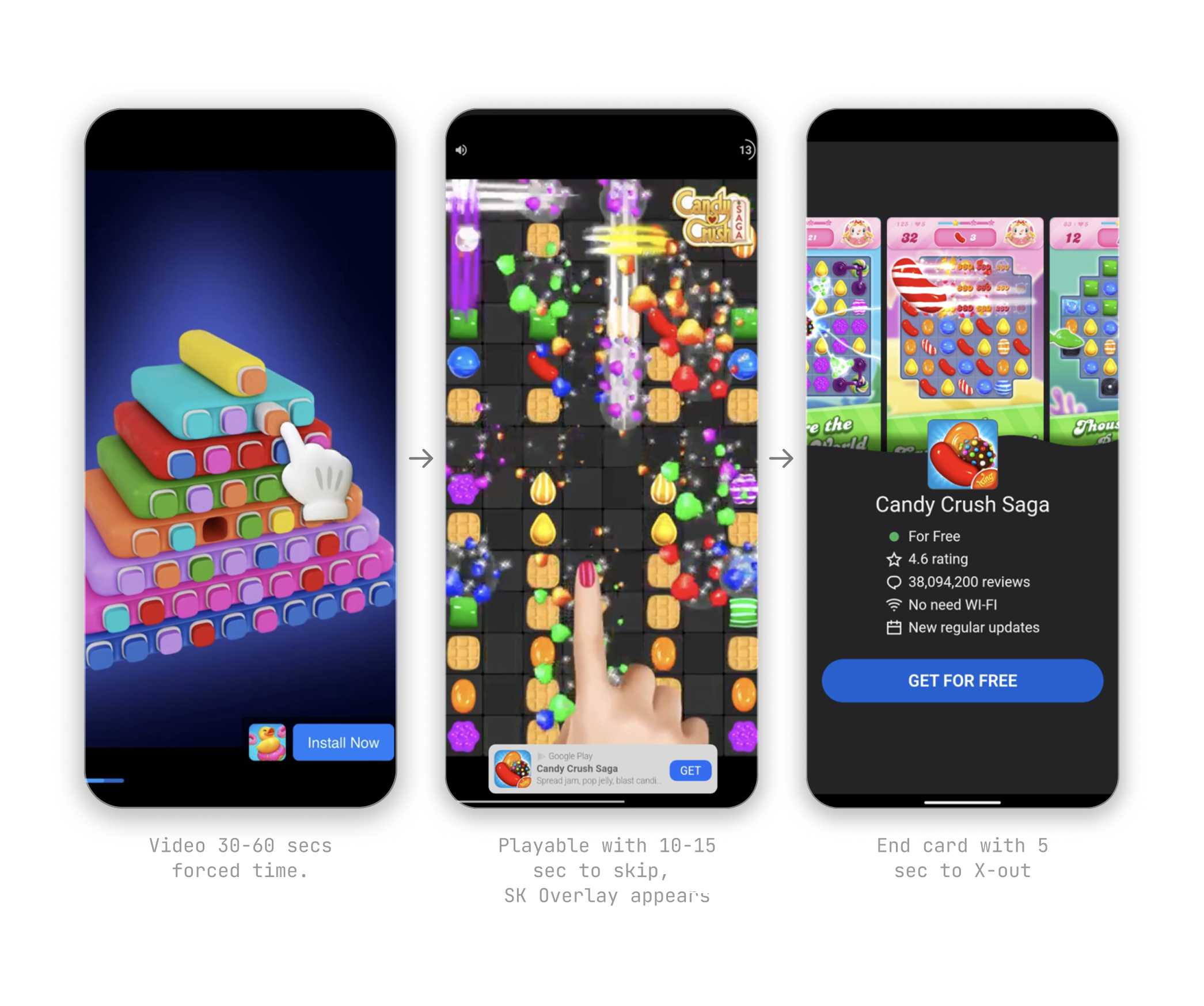
AppLovin's three-step funnel: video ad, playable demo, install. Meta's equivalent at the time was a single "Install now" CTA with no demo path.
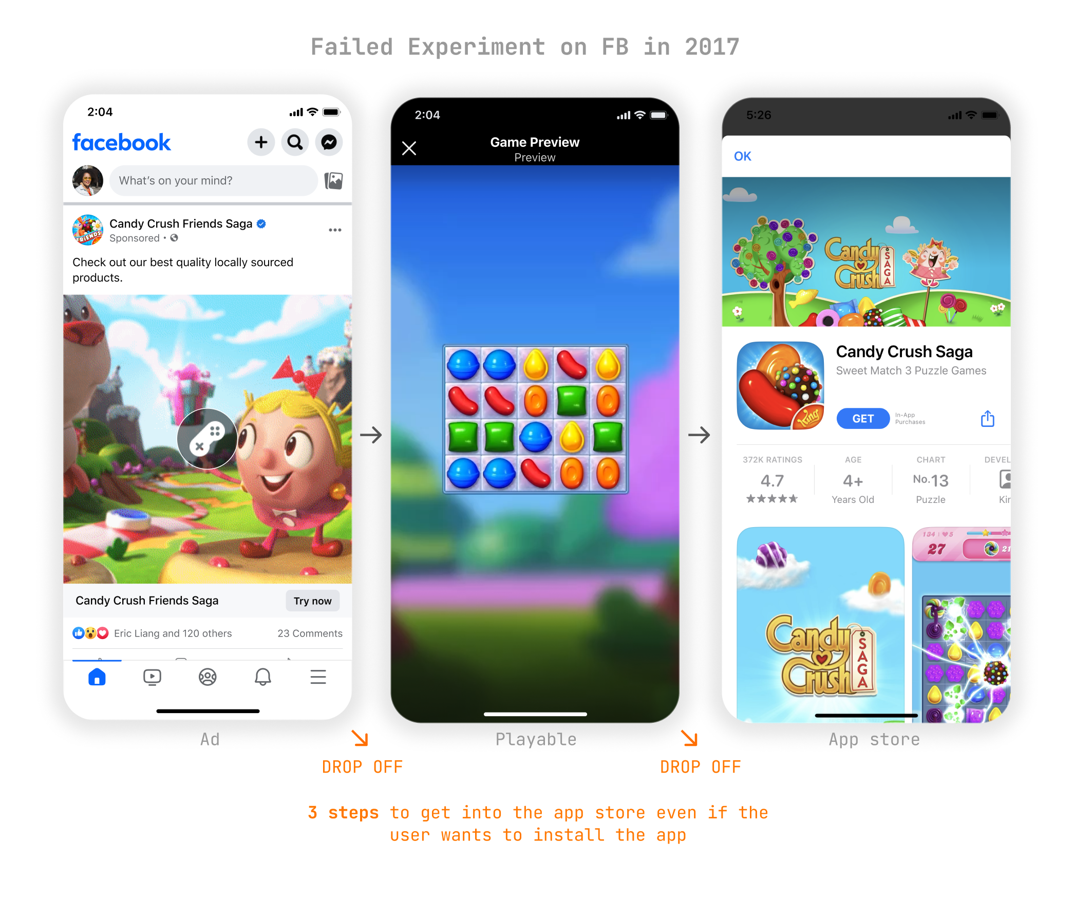
The single-CTA drop-off diagram. Replacing "Install now" with "Try demo" removed the direct install path and added multiple new exit points.
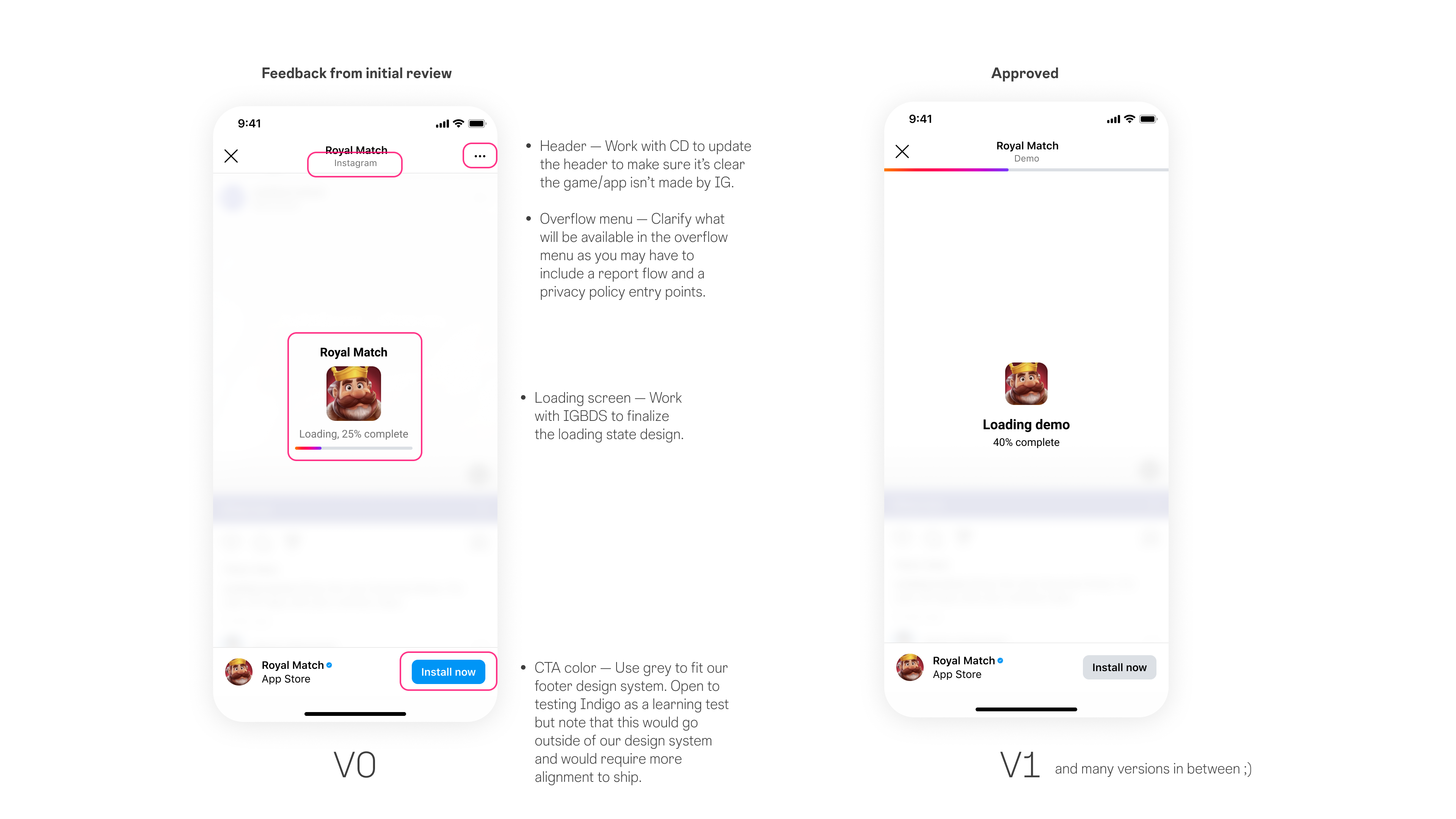
Meta's previous attempt replaced "Install now" with a single "Try demo" CTA. It cannibalized direct conversions. A video ad has one path: the App Store. A playable with only a demo CTA introduced multiple drop-off points and removed that direct path entirely. The format was supposed to make installing easier. It was doing the opposite.
The data had a wrinkle, though. On goals deeper down the funnel like purchases and retention, the demos beat video outright. People who played first installed with more conviction, and stuck around longer.
The design challenge was serving both user groups in the same ad unit without killing either path. And doing it on Instagram, a platform that had never supported the format and was protective of every pixel in the feed.
Designing Against the Pattern
Starting from zero
This started as an unfunded experiment, and I scoped it end to end: the one-pager, the success criteria, the redesign. The bar was simple. Beat a traditional video ad. We ran a baseline test on Facebook to check, and in most campaigns playables matched or beat video. Further down the funnel the margin was decisive.
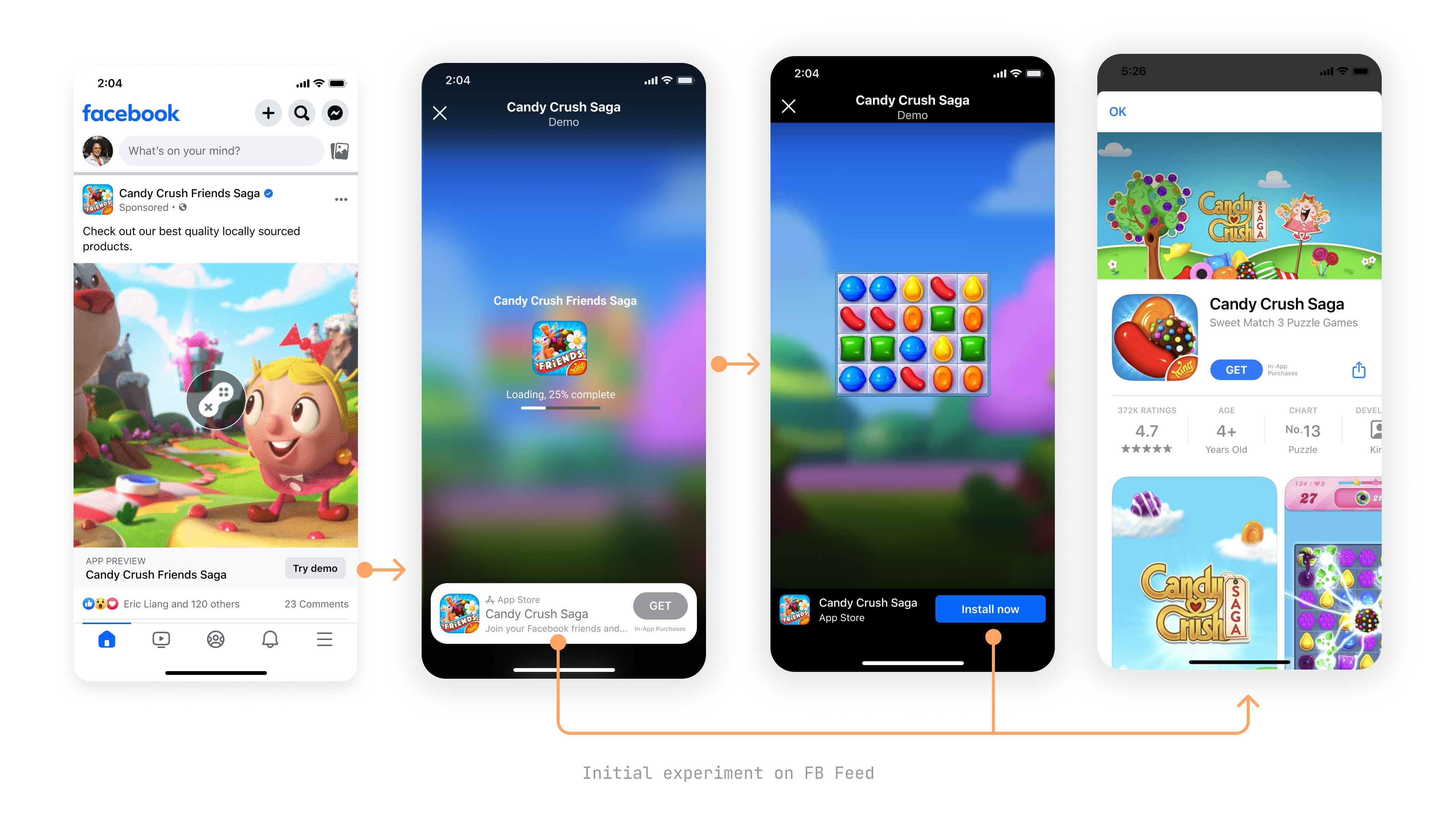
Initial experiment on Facebook Feed.
The data was enough to make the case, but I didn't pitch it with a deck. I built working prototypes, vibe-coded in Figma Make. Rough, but functional enough to show in context. A ten-second demo communicated the concept faster than any document could. Leadership got it immediately. The conversation went from "explain this format" to "when can we test it."
The experiment became a funded workstream.
The dual-CTA problem
Since the earlier single-CTA version had killed the install path, the fix was obvious: put both "Install now" and "Try demo" in the same ad unit. No dual-CTA model existed on Instagram, so I designed five concepts for how it could work on Reels.
I weighed a range of concepts against four trade-offs: discoverability, disruption, nativity, and complexity.
Ranking
Rank either play or install based on user intent.
Risk: relying on the ranking model. Can we actually achieve this?
High intent → Install now CTA
Low intent → Try demo CTA → App Store
Attribution pill
Use the attribution pill row, adding a "Try demo" pill beside the sponsored pill.
Attribution pill on the Reel
Attribution pill with intent ranking ★ Worth testing
Use the attribution pill row with a "Try demo" pill, then add intent ranking. Users with high intent see the Install CTA with a demo pill; users with low intent see the inverse.
High intent → CTA Install, pill Demo
Low intent → CTA Demo, pill Install
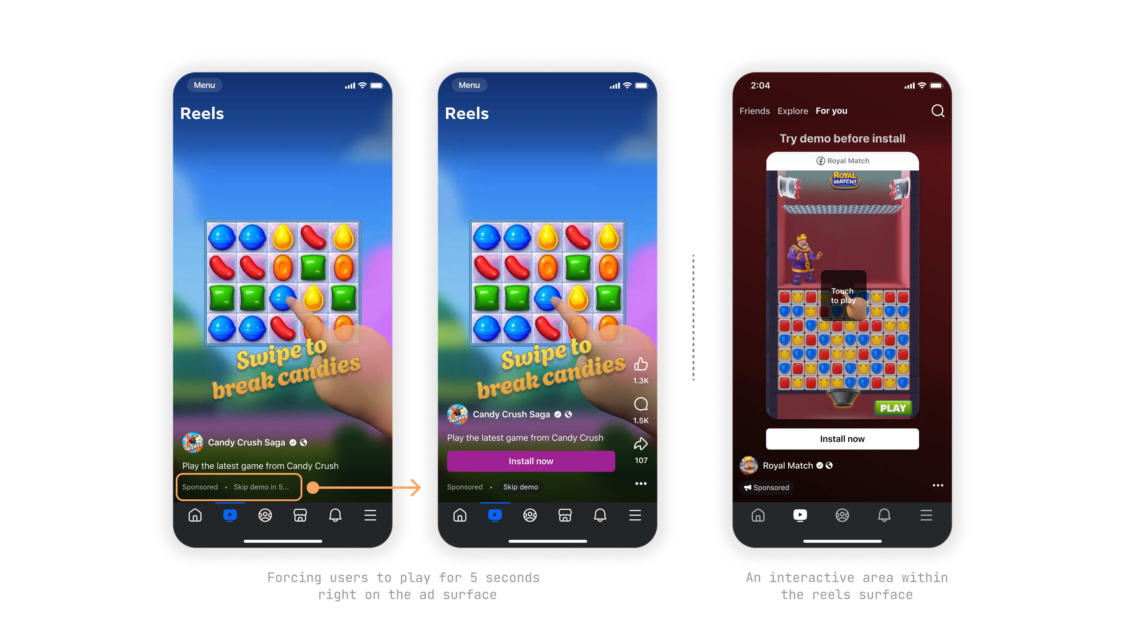
Mid-Scene ★ Recommended
Using the new mid-scene pattern, surface a "Try demo" pill alongside the standard Install now CTA as the core CTA.
Mid-scene dual CTA
SK Overlay
The CTA stays "Try demo", but SKOverlay appears on dwell to drive the install.
SKOverlay install
I fought for the mid-scene overlay. Getting a new CTA pattern onto Reels meant a rigorous review, so I anchored the conversation with aggressive concepts first (playables on impression, full-surface takeovers), then presented mid-scene as the measured alternative. It worked.
Different variants of Dual CTA in mid-scene
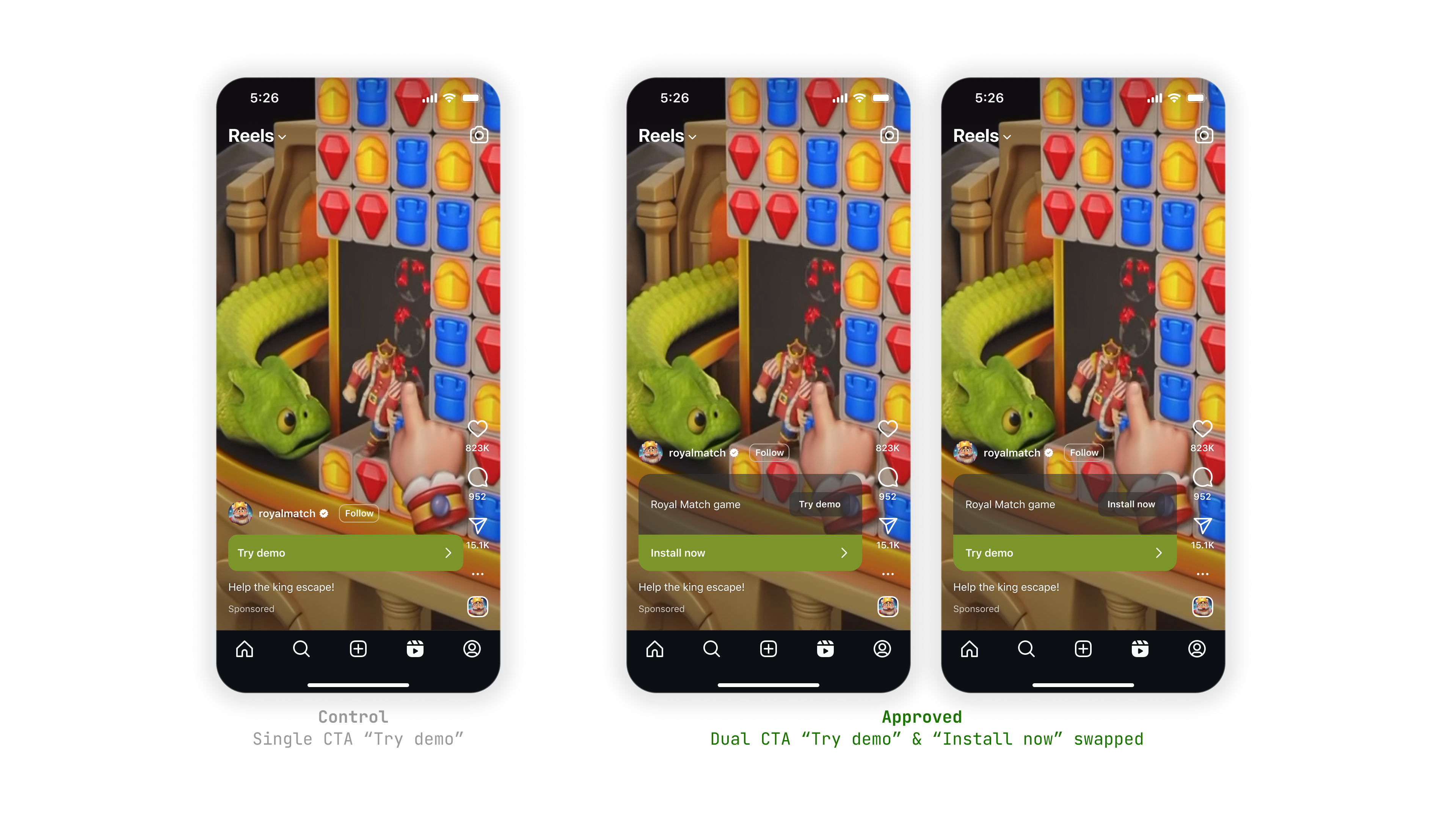
Before and after. Left: the single-CTA control that removed the install path. Right: the approved dual-CTA design that keeps both options in one ad unit.
From Experiment to Platform
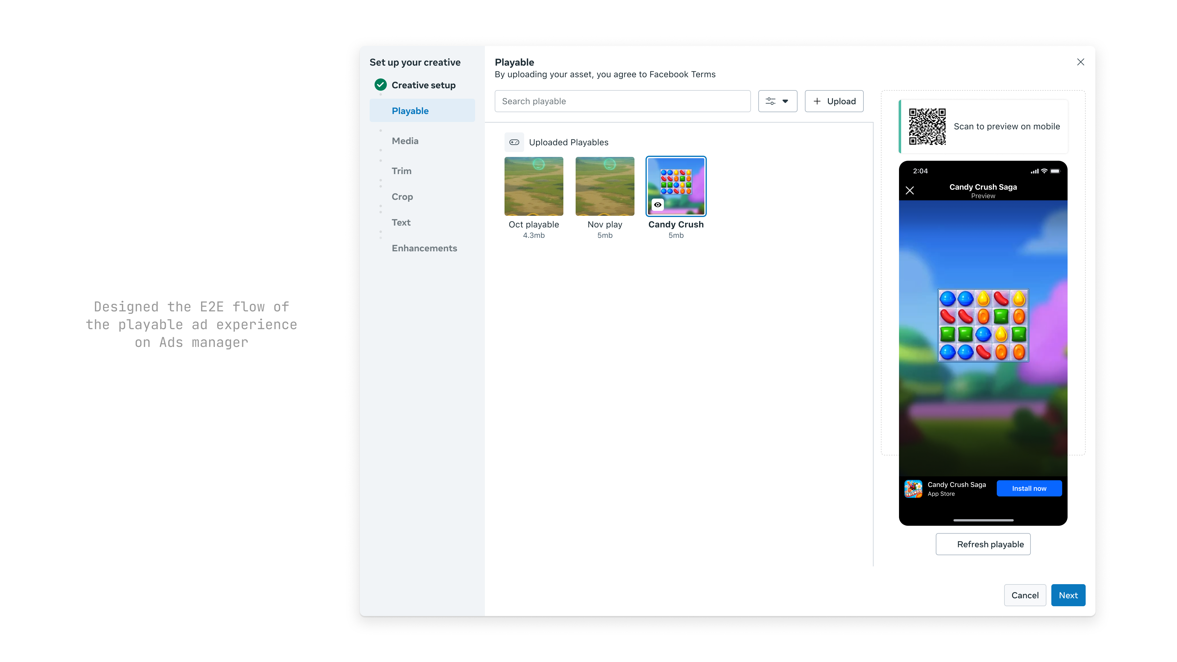
Shipping meant winning a separate design review for every surface across both apps, working with each format owner in turn. iOS and Android each needed their own solution.
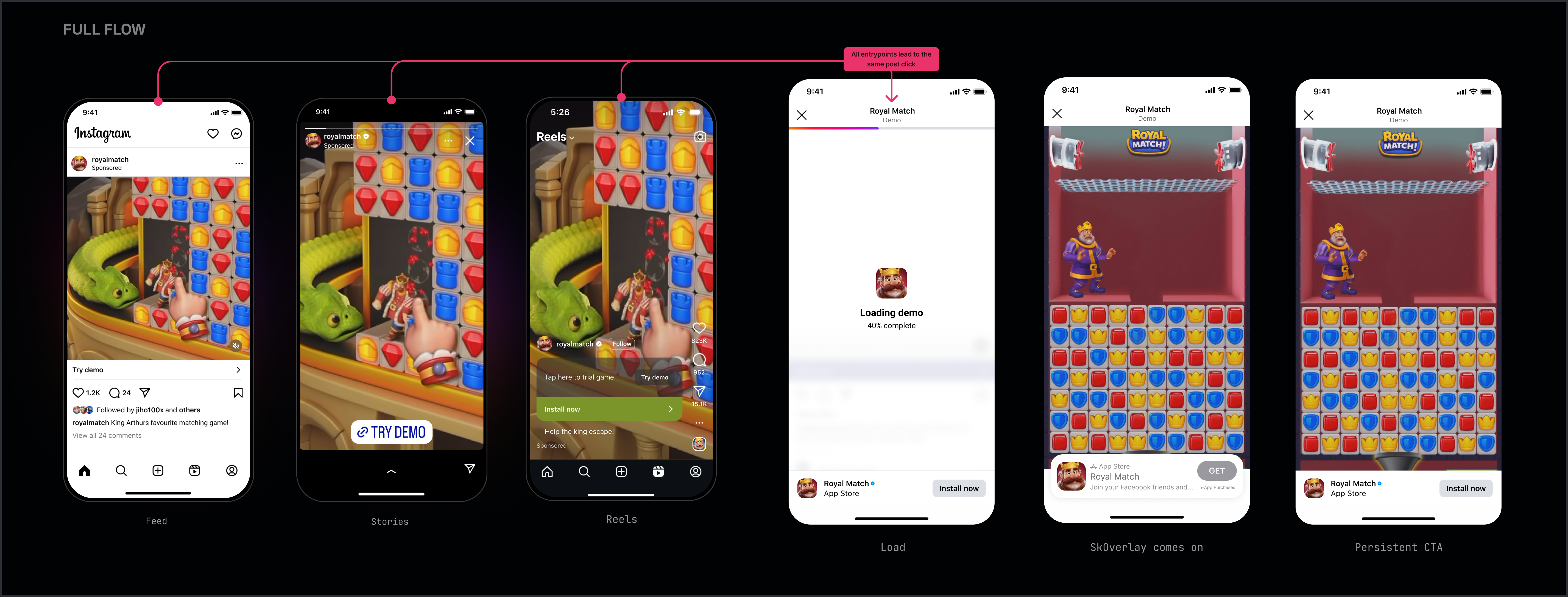
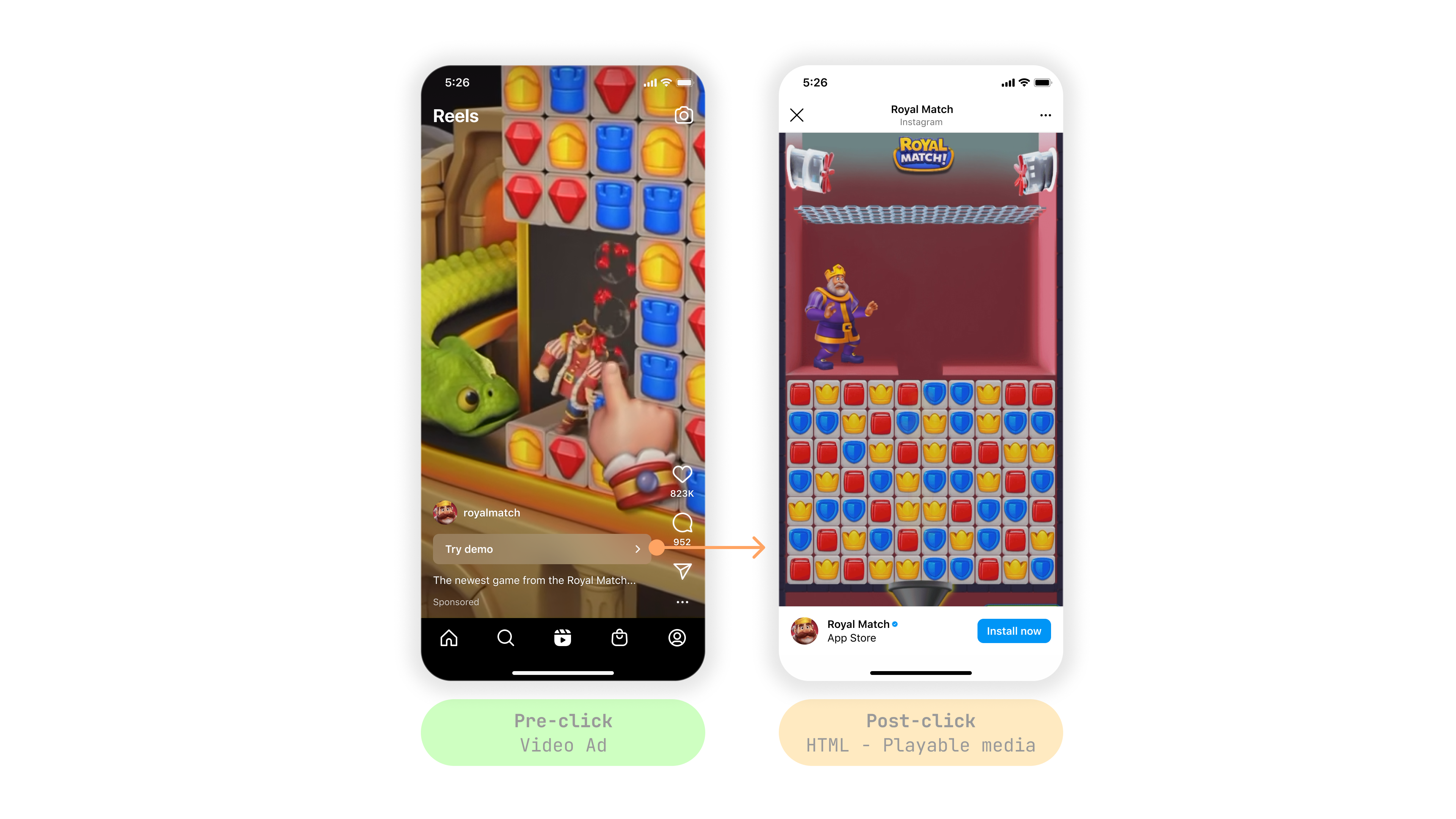
End to End Flow
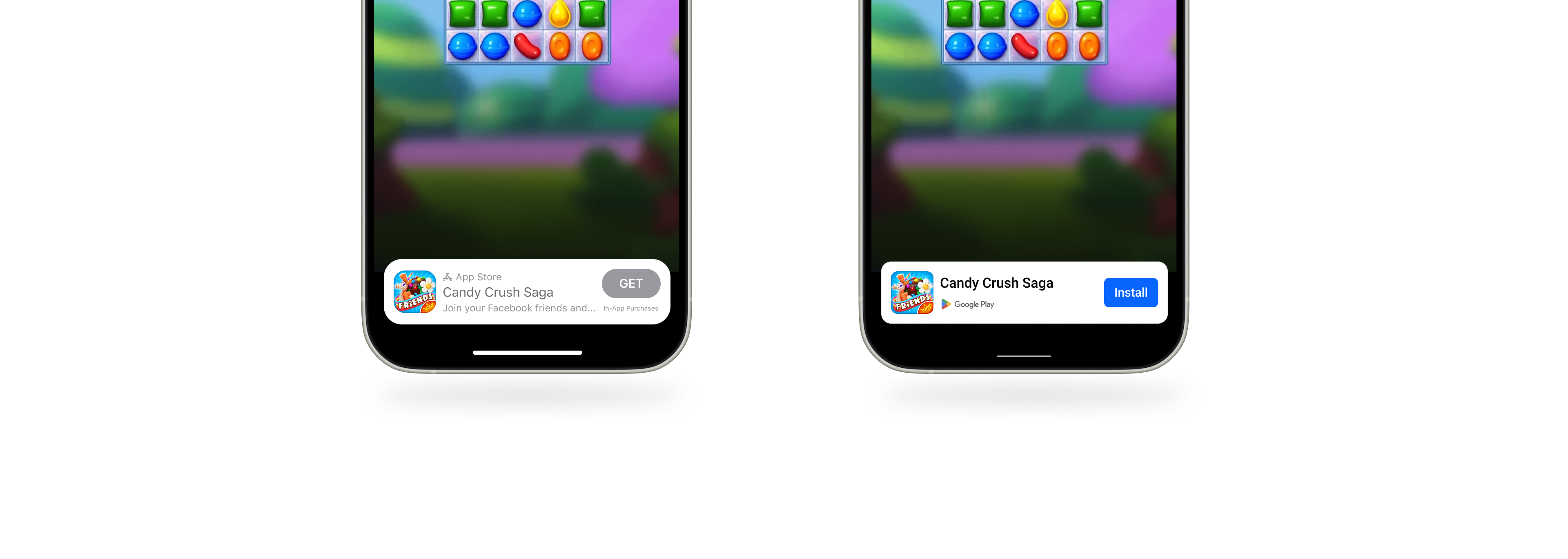
The user encounters a video ad with two CTAs: "Install now" for users ready to convert, and "Try demo" for users who want to interact first. Tapping "Try demo" opens the playable, an HTML experience inside Meta's in-app browser, where the user demos the app with a persistent install CTA anchored at the bottom. On iOS, Apple's SKOverlay (a native component that shows basic app metadata) lets users install without leaving the ad.
Designing Android's SKOverlay from scratch
Android has no equivalent of Apple's SKOverlay, so I designed one. Same goal (app metadata, ratings, one-tap install) but built from scratch for a platform without the convention. The work got Google involved; they started building a native Android version of the floating CTA, so users could install straight from the hovercard.
Apple's native SKOverlay component. Android had no equivalent, so I designed one from scratch, this lead to conversations with Google having their own SKOverlay equivalent.
What I cut
I designed multiple iterations of playable ads on impression: letting users interact with the demo directly on the surface, no post-click transition. It was the most ambitious concept and I pushed hard for it. It got rejected. I agreed with the call.
Playables on impression. Rejected.
Users don't expect an ad to behave like an app. Dropping a game straight into a Reel breaks how people read the surface. That post-click tap matters: it's the moment a user chooses to enter the demo. Take the choice away and the format just feels invasive.
From Two People to a Team
Advertisers adopted the format immediately. They were already producing playable assets for AppLovin, so running them on Meta required no additional creative production. It also opened a path beyond gaming into e-commerce and other app verticals, anywhere letting people try the thing first makes the download feel less of a gamble.
Two people and a prototype turned into a pitch that put the format live across both apps, won a dedicated team, and secured a fully funded roadmap within App & Gaming Monetization.
"The thing that actually moved this forward had nothing to do with polishing screens. I got a rough, working prototype in front of leadership while the idea was still cheap to kill, and that's what got it funded."
I didn't show everything. Here are a few more pieces of the system I designed for this project.